Three posters on a dark textured wall with a seating area below. The first poster shows a man with tattoos wearing a cap, with the text "Inked and Educated" and "Don't Stereotype!". The second poster features a woman with tattoos, with the text "Looks are Deceiving" and "Don't Stereotype!". The third poster depicts a man and a woman with tattoos together, with the text "We are People" and "Don't Stereotype!".

This project was to produce a series of deliverables that are the most appropriate for a topic that was chosen and the delivery of the message.

The message that I chose was tattoo stereotyping. Hitting close to home, with many people in my life being covered in tattoos, this was a chance to show that we are still people.

Triptych Posters

For stereotyping, the idea for the three posters is to hit each key point, which is race, gender, and the way someone looks. Each poster will portray how just because someone is this way does not mean they are any different than the other person. Everyone is capable of doing the same thing. The way you look does not affect how someone acts or does something.

The beginning part was creating a thesis statement of the concept that was being chosen and why we thought this was a good choice. Bouncing back and forth between stereotyping as one for race, gender, and the way someone looked was the beginning.

Thesis Strategy

Sketches

The idea was to sketch out different designs that hit all these points. But show that we are equal and all different in our own ways.

See, most people do not talk about stereotyping, but it is a topic around us in today's society, from racial to gender, and how someone looks, for example, covered in tattoos. Stereotyping can affect someone more than people realize.

Sketch of a social media post celebrating gender stereotypes, featuring stick figures of a girl and a boy, with handwritten text promoting breaking gender stereotypes and using hashtag #IAmWhoAm, with color labels for blue and pink.
Sketch of a sign titled 'This is Me' with hand-drawn illustrations of a male and female, along with handwritten notes about gender and changes.
A hand-drawn sketch of a person wearing glasses and a coat, with the text 'Inked and educated don't stereotype' written below.
A sketch of a poster design with a portrait of a person, eyes, lips, and eyes outlined with handwritten text. The text says 'WE ARE NOT STEREOTYPE' with some words crossed out, and there is an arrow pointing to the right indicating 'POART OF THIS PHOTO'.
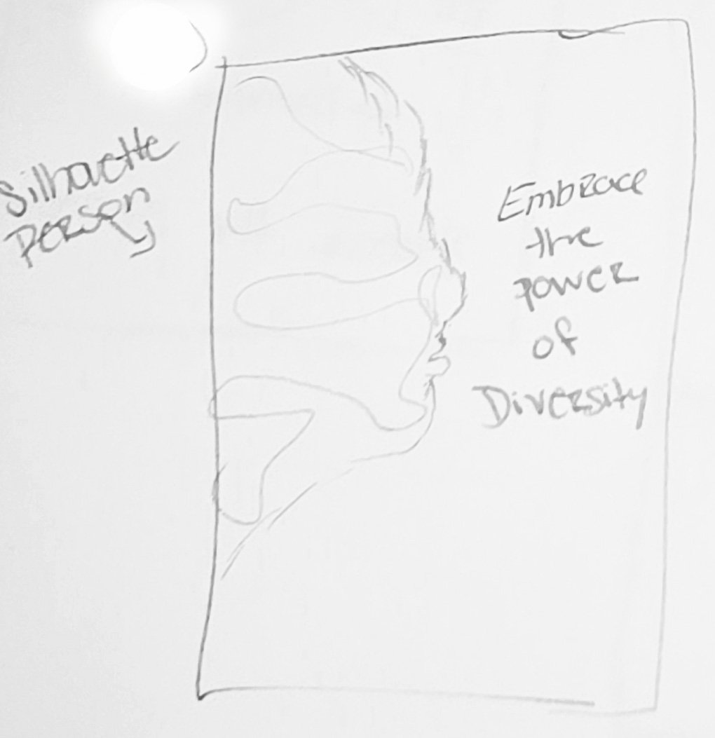
Hand-drawn profile of a woman’s face with the phrase "Embrace the power of Diversity" and "Silhouette Pose" written next to it.
Sketch of a fingerprint with the caption "We are one human race" and a note stating "Finger print with all colors of skin tones".

For the final design went with a few different font choices, but all had white as the color.

This decision was made to be able to tell the story of each person being portrayed within the poster.

Title: Poppins Bold

Body: PT Serif Bold

Call to Action: Ariel

Typeface

Sample of three different fonts: Poppins Bold, PT Serif Bold, and Arial Regular, displaying uppercase and lowercase letters, numbers, and symbols.

Color Palette

Using white as the font color helps make the words stand out against the image for an easy read. Letting the stories stand out on their own.

Hex: FFFFFF

RGB: 255,255,255

CMYK: 0,0,0,0

Digital Initial 1

After some thought, decided to go the route of stereotyping. This was because most do not see this topic when thinking of posters.

Each set was created to show different people and who they are. Trying the black-and-white feel with the first set to try and put in the saying that I have lived by, is that it conveys emotion, tells a story, or expresses oneself.

Three black and white photos of diverse people with tattoos, with the text 'Don't Stereotype' on each image and additional messages about tattoos and stereotypes.

Digital Initial 2

With this direction, was wanting to try the half poster just showing the work environment in tattoos through the hands. Adding color and some facts and shows three different work areas. 

Although all of the sets showcase that we should not stereotype. This is where the process of figuring out the direction to go began.

A digital graphic with three sections promoting tattoos and breaking stereotypes. The first section shows tattooed hands holding a coffee mug, with the text "Inked & Educated". The second section shows a soldier with tattoos on his arm, with the text "Don't Judge". The third section shows two people shaking hands, with the text "We are People".

Digital Initial 3

Once figured out the direction, had to start looking for a sponsorship that worked to help against stereotyping tattoos. And create a different design that showcased the message. The goal was to make sure the eyes all lined up with each other.

Changed the images from Black and White, then tried to find images that were more of showing the face. Took the STATS away and kept the small quote. With that, left-aligned all the words and found a sponsorship for stereotyping.

A collage of three photos featuring diverse people with tattoos, accompanied by messages promoting no stereotypes about tattoos. The first person is a man with tattoos reading a book, with the message "Inked & Educated. A tattoo does not make you a criminal. We are more than our appearance. Don’t Stereotype!" The second person is a smiling woman with tattoos and a head wrap, with the message "Don’t judge. You never know what paths they have walked. Don’t Stereotype!" The third photo shows an elderly couple covered in tattoos, with the message "We are People. Some of the nicest people you will ever meet are covered in tattoos. Don’t Stereotype!" The collage promotes positive perceptions of people with tattoos.

Digital Initial 4

After learning that showing the subject looking at the audience was better, I tried to find images that showed the people’s faces better. Edited the color balance within the images to have the same feel. Within this design, went back and removed the sponsorship that I had used. After more research hit a bump in the road where there were no sponsorships. Due to this, I created my own and designed a logo for it.

Three people with tattoos, each with a message about stereotypes and individuality. The first is a man with a tattooed arm and a black beanie, the second is a woman with tattoos and red hair, the third is a bearded man with sunglasses and a tattooed arm, and a woman with platinum blonde hair and tattoos. The text emphasizes that tattoos do not define morality, understanding, or character, and encourages not to stereotype.

Sponsorship Branding

When it came to thinking about the sponsorship logo, I kept in mind my research on tattoo parlor typefaces and symbols' different meanings.

Sketches

The idea was to find a symbol that represented change and rebirth through hard times. Everything drew me back to the lotus flower, which symbolizes strength, resilience, and rebirth.

From there, I wanted a bit more, so I did more research to find the idea of the moon and a little bit of some vines.

Moon: cyclicality and rebirth

Vines: personal growth and interconnectedness of life

Sketch of a lotus flower with leaves, moons, and dots.
Simple pencil sketch of a stylized lotus flower with multiple petals
A sketch of a five-petaled flower with dots around it.
A simple line drawing of a crescent moon with a sleeping face, surrounded by leaves and a flower.

Typeface

Wanting something that went with the theme of tattoos… looked around at different tattoo parlors’ logos to get inspiration. From there, though, having that rough look to the words would show depth.

Image of the Blood Crow font displaying the alphabet in uppercase and lowercase, numbers, and special characters.

Color Palette

Wanting that rough look to the font and against the background of the posters chose to go with white with a transparent background to it to blend with each image.

Hex: FFFFFF

RGB: 255,255,255

CMYK: 0,0,0,0

Final Design

From bouncing back and forth on the name of the sponsorship… being between “Inked for Change” and “Art Beyond Labels,” felt that Inked for Change fit the direction the posters were going.

Logo with a stylized moon and leaves, and the text 'Inked for Change' in a decorative font.

Final Design

Feeling like the middle photo did not showcase just what was needed due to the difference in shapes and colors that replaced that image. Instead of having some saying that was trying to state we are all equal went and found quotes from people telling their stories.

From there, the layout of where the title was relocated, redesigned the logo, and gave each poster its own story.

A young man with a beard and tattoos on his arm, wearing a black beanie, sitting indoors. The image is a partial close-up showing his thoughtful expression, with text overlay that reads 'Inked and Educated' and 'Don't Stereotype!'.
A woman with long black hair and tattoos on both her arms, sitting by a window, looking at the camera. She wears makeup, jewelry, and has a contemplative expression.
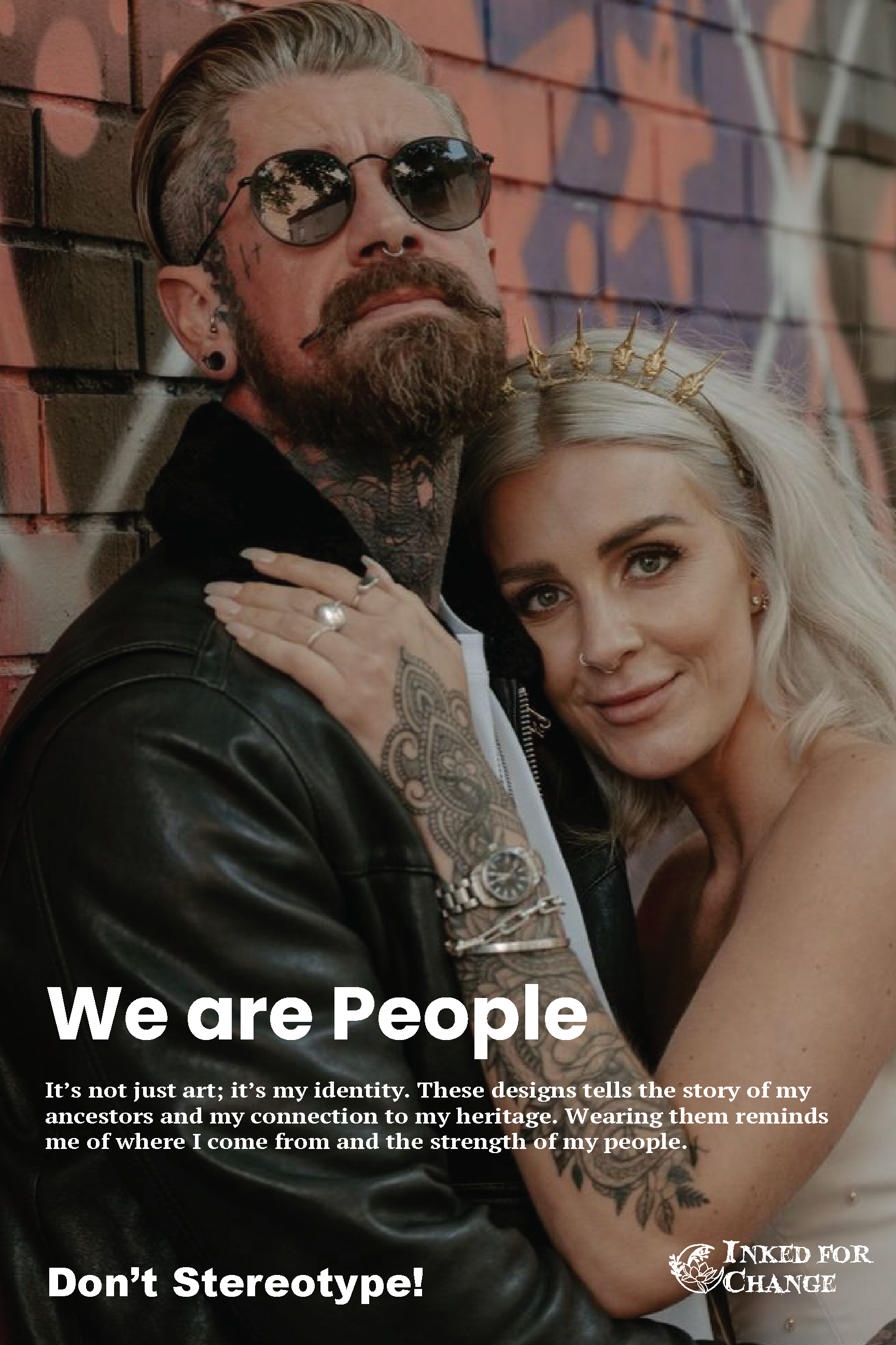
A man with tattoos, beard, and sunglasses embracing a woman with blonde hair and a tiara, standing against a brick wall with graffiti. The image promotes diversity and challenges stereotypes.

Environmental Contact

A city street scene during evening with blurred motion of walking pedestrians and a moving bus. A bus stop on the sidewalk features an illuminated advertisement with a woman and message about stereotypes and tattoos. The street is wet, reflecting the city lights, and has scattered fallen leaves. Buildings with lit windows line the street, and trees with remaining autumn leaves are overhead.
A poster featuring a man with tattoos, sunglasses, and a beard, embracing a woman with platinum blonde hair and a tiara, against a brick wall. The poster contains the text 'We are People,' a message about identity and heritage, and the slogan 'Don't Stereotype!'.
Three large posters in the windows of a building featuring diverse individuals with messages promoting against stereotypes and for self-identity. The first shows a tattooed man in a cap with the caption "Don't Stereotype!" The second shows a woman with tattoos, with the caption "Looks are Deceiving." The third shows a bearded man and a woman with platinum blonde hair embracing, with the caption "We are People." Each includes a message about individuality and rejecting stereotypes.
Street scene with tall buildings, trees, and a man with tattoos wearing a black cap and shirt, standing in front of an advertisement poster that promotes education, creativity, and diversity.
Three posters on a wall display messages about avoiding stereotypes, featuring diverse individuals with tattoos. A person in a plaid shirt walks past the posters, with some greenery in the foreground.
Three large posters on a dark wall, each featuring diverse tattooed individuals with messages against stereotypes. The left poster shows a man with tattoos and a cap, with a message about inked and educated. The middle poster features a woman with tattoos resting her chin on her hands, with a message about looks and living. The right poster depicts a man with sunglasses and a woman with platinum blonde hair and tattoos, with a message about being people. A silhouette of a person stands in front of the posters, reading them.